I have a new card design to share! It's a blue and white pattern inspired by a longtime love of geometric tile patterns. I've always been crazy for tile patterns, even before learning about
tessellations in fifth grade math class. One of my favorite things about living in Buenos Aires was being surrounded by amazing patterned tiles everywhere, on floors and walls and ceilings, indoors and out. I was lucky enough to live near the tile district and walk past dusty shop windows filled with ceramic and encaustic tiles, new and old, stacked in crazy kaleidoscopic displays of color. But my favorite tiles are the traditional blue-and-white patterns, cool and crisp and clean, set into dusty terra cotta walls. I couldn't decide on just one tile pattern for this card so it's got a little bit of everything. I think it's a pretty and versatile greeting card, blank inside, suitable for any message or any occasion. Hand-silkscreened in my home studio on 110# French Paper, made in the USA.
This card is available for purchase now in my Etsy shop! and this design is also available as a textile print on a variety of beautiful fabrics, via spoonflower.com.

i've made a whole flickr set of patterned tiles
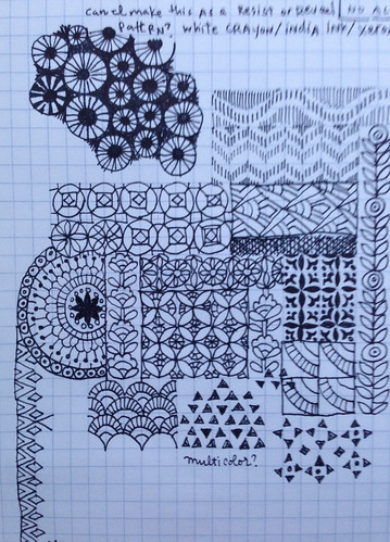
It's hard to say exactly where this card idea got started, because I can't even remember a time when I wasn't snapping photos of beautiful tile patterns and doodling them on all my sketchbook pages. Here are just a few of many examples:
I started sketching this card design on the computer, as a simple pattern of repeating tiles, and then I tried a few different variations on the theme, with different tile patterns, trying to choose my favorite and wishing I could make 10 cards so I could use them all...
first sketches
And then I remembered seeing these tiles on a storefront in Buenos Aires, years ago. I loved the mix of so many different tile patterns used together, loved it so much that I snapped a photo.
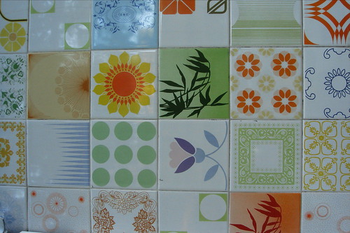
tiles on a storefront. i think this was a mens' boutique somewhere in the palermo neighborhood of buenos aires.
Which gave me the idea to just go ahead and use a little bit of everything together in one design. Kind of a "wow!" moment!
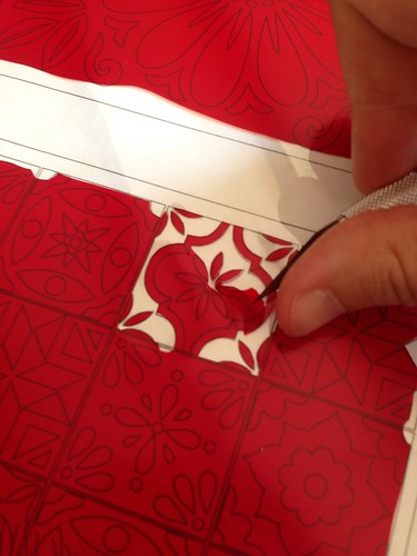
Once I figured out my final design, I printed it out and used Rubylith to make the film. I could just print directly from the computer onto film, but I love Rubylith and I think the process of cutting the pattern by hand is fun and gives the finished product a more human, handmade feeling that's missing if I just print the film directly from the computer. There are always little irregularities that come from making hand-cut film.
Rubylith is cool stuff. It's a translucent, ruby-red film that comes in big sheets or rolls. It's actually a two-layer film, the thicker layer is just clear acetate and thinner layer is the red color. Because it's translucent, you can lay it over a sketch and trace it quickly and easily. I use a fine x-acto blade to carefully cut through the red layer, leaving the thicker film intact. Then peel away the red film from some areas, leaving your final image in red, with a clear background. When I expose my screen using this film, the red film will block the light, preventing those areas from being exposed. Silkscreening uses a film positive (unlike photography, which uses a film negative) so the areas that are left in red are the areas that will be printed on the final product.
Rubylith is marvelous for its crisp, sharp edges and ability to handle teeny-tiny details. A textile design teacher told me that (before computers) rubylith used to be the standard for tie pattern designers, because tie patterns are so insanely fine and detailed and rubylith is perfect for those details. All this meticulous slicing and peeling is a fussy job and I'm sure most people wouldn't enjoy it but I find it meditative and relaxing and just the kind of obsessive task that I love. And a little mistake is easy to fix with a bit of scotch tape. After an hour of cutting my worktable is littered with all the pretty little red snippets that I've peeled away.
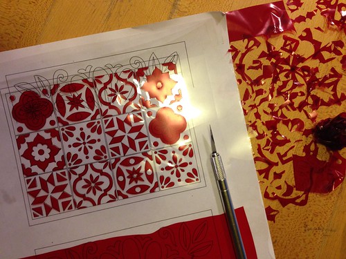
cutting rubylith film
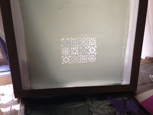
silkscreen, ready to print
And then the design is done! I use this film positive to expose a silkscreen that I've coated with light-sensitive emulsion in my darkroom. (You can learn a bit more about the silkscreen process in another post, here.) I usually silkscreen on fabric so I have to use different screens, with a finer mesh fabric, to print on paper. I printed a small batch of about 50 of these cards for the first run, but I think I'll be printing lots more of these in the future.
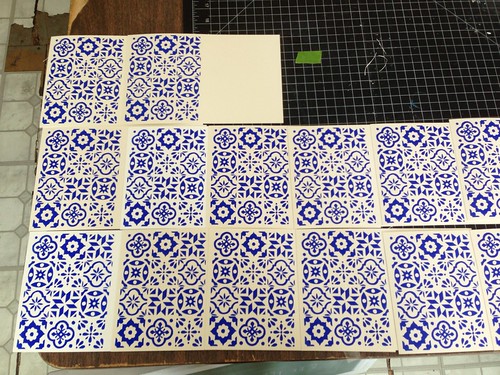
first batch of printed cards drying in the studio

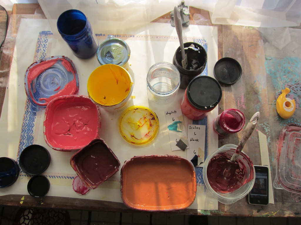
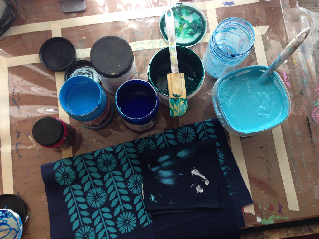 image: mixing ink colors for Hand printed Blue Flowers organic cotton canvas tote bag, $54.
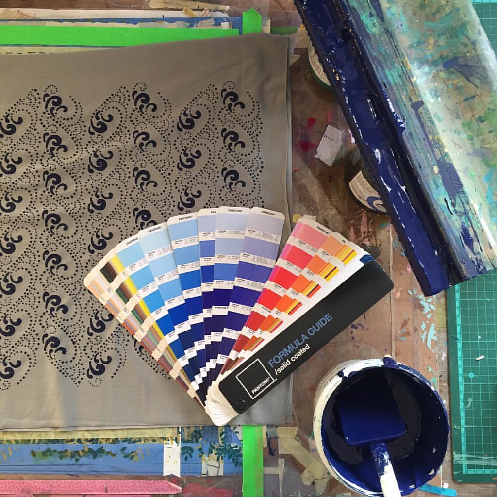 image: matching colors for Grey bamboo scarf with Blue Waves pattern, $36.
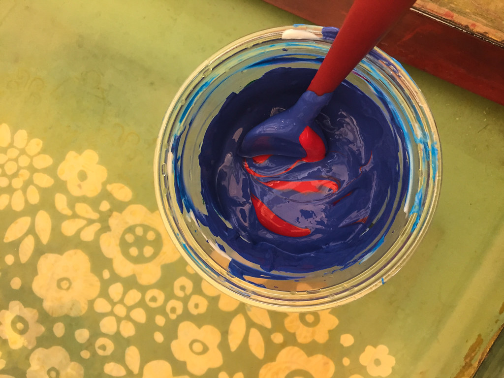 image: mixing purple ink for Soft grey bamboo scarf with hand-printed purple Mayflowers pattern, $36.